CoronaNet Example
Download the script here
1 Set up
rm(list=ls())

library(readr)
library(tidyverse)
2 Loading the dataset & do previous data management
coronaNet <- read_csv("data/coronanet_release.csv")
wb <- read_csv("data/API_NY.GDP.PCAP.PP.CD_DS2_en_csv_v2_988619.csv", skip = 4)

businessRestrict = coronaNet %>% filter(type %in% c("Restriction and Regulation of Businesses" ,"Restriction of Non-Essential Businesses"))

wb = wb %>% gather("year", "gdpPPP", -`Country Name`, -`Country Code`, -`Indicator Name`, -`Indicator Code`, -X65)

wb = wb %>% select( -`Indicator Name`, -`Indicator Code`, -X65)
wb$year = as.numeric(wb$year)
wb$lgdpPPP= log(wb$gdpPPP)


data = merge(businessRestrict, wb %>% filter(year == 2018), by.x = 'ISO_A3', by.y = "Country Code", all.x = TRUE)

dataAgg = data %>%
  group_by(country) %>%
  summarise(numBusinessRestrictions = n(),
            gdpPPP = mean(gdpPPP))

dataAgg$gdpDum = ifelse(dataAgg$gdpPPP > mean(dataAgg$gdpPPP, na.rm = TRUE), "Above Average GDP", "Below Average GDP")
dataAgg = dataAgg %>% filter(!is.na(gdpDum))
3 Creating a Plot
businessRestrictAgg = businessRestrict %>%
  group_by(date_announced, country) %>%
  summarise(numBusinessRestrictions = n())

dframe = expand.grid(unique(coronaNet$date_announced), unique(coronaNet$country))
names(dframe) = c('date_announced', 'country')

businessRestrictFull = merge(dframe, businessRestrictAgg, by = c('date_announced', 'country'), all.x = TRUE)
businessRestrictFull$numBusinessRestrictions = ifelse(is.na(businessRestrictFull$numBusinessRestrictions), 0, businessRestrictFull$numBusinessRestrictions)


# lets plot business restrictions over time
ggplot(data = businessRestrictFull) +
  geom_point(aes(x = date_announced, y = numBusinessRestrictions ))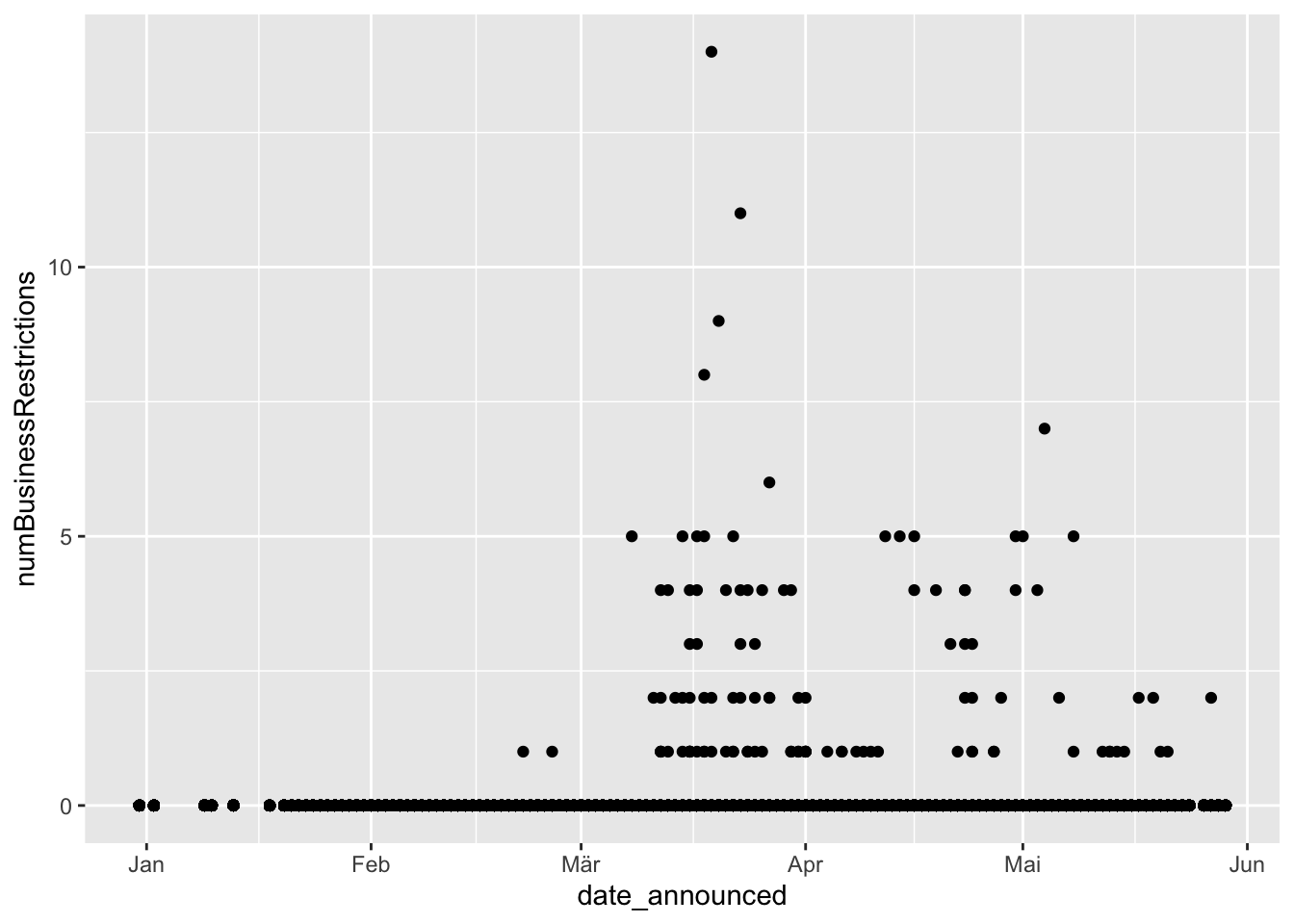
# hmmm, how can we distinguish by country?
ggplot(data =businessRestrictFull) +
  geom_point(aes(x = date_announced, y = numBusinessRestrictions, color = country)) +
  theme(legend.position =  "none")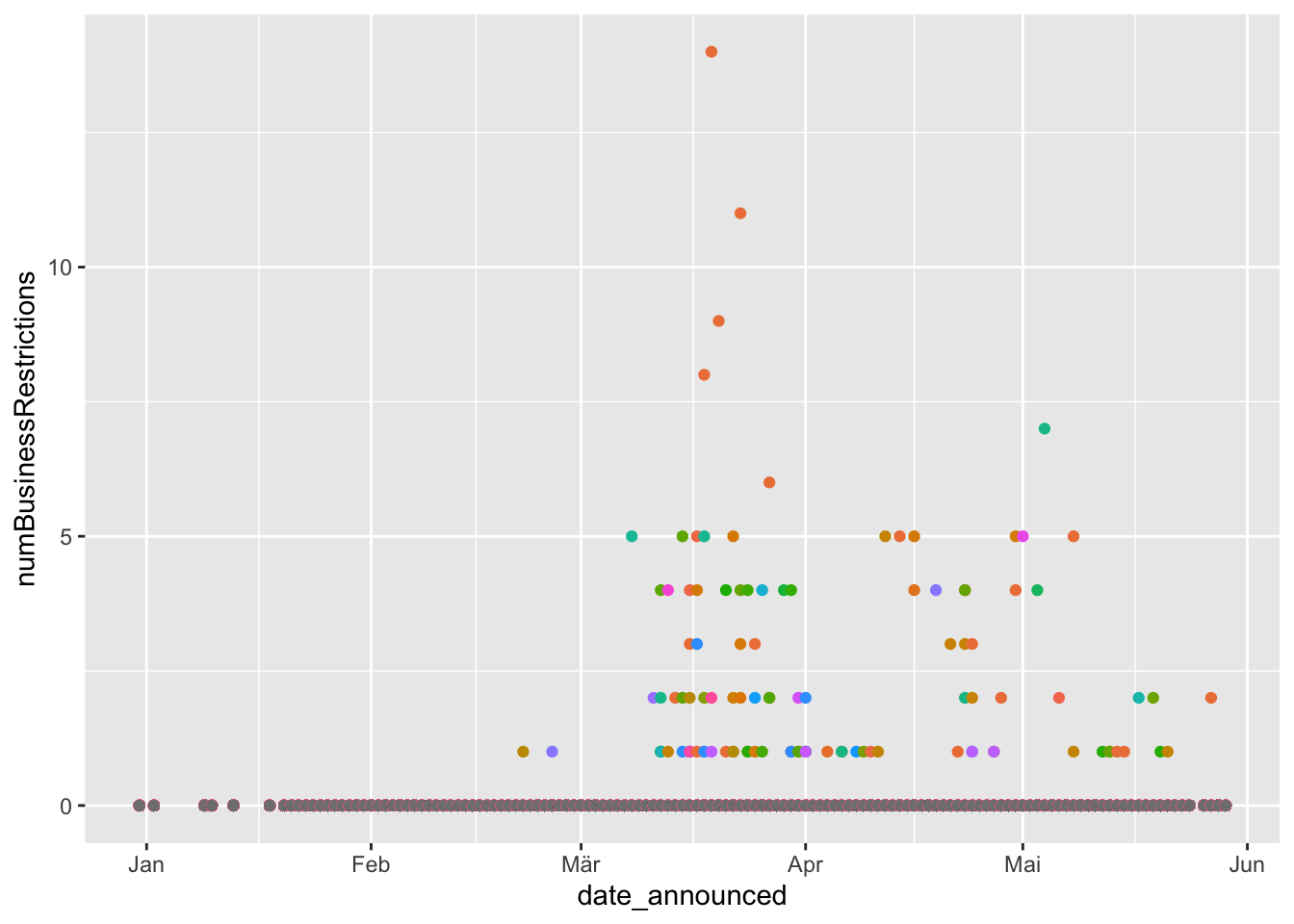
ggplot(data = businessRestrictFull) +
  geom_point(aes(x = date_announced, y = numBusinessRestrictions, shape = country)) +
  theme(legend.position =  "none")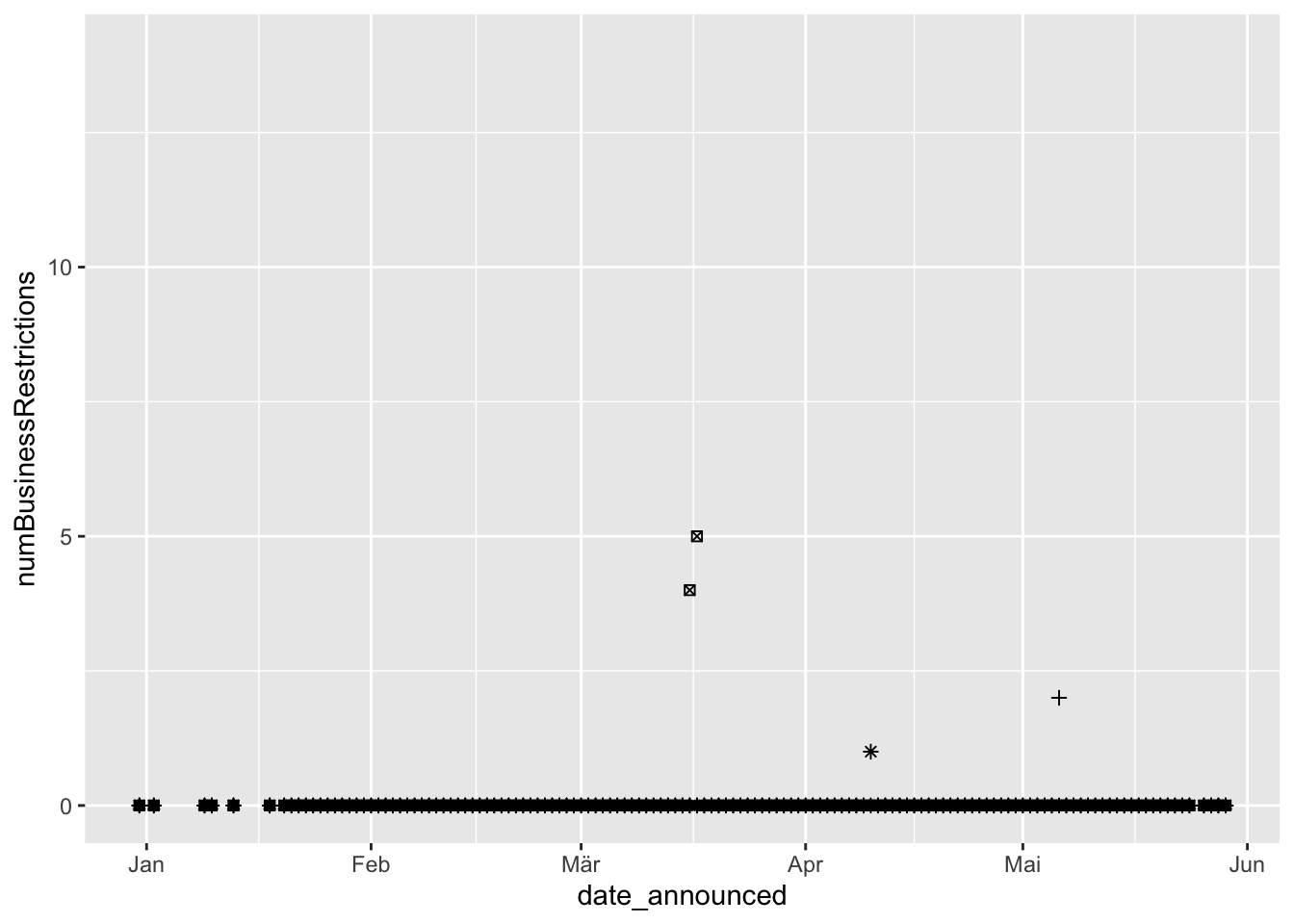
ggplot(data = businessRestrictFull) +
  geom_point(aes(x = date_announced, y = numBusinessRestrictions, size = country)) +
  theme(legend.position =  "none")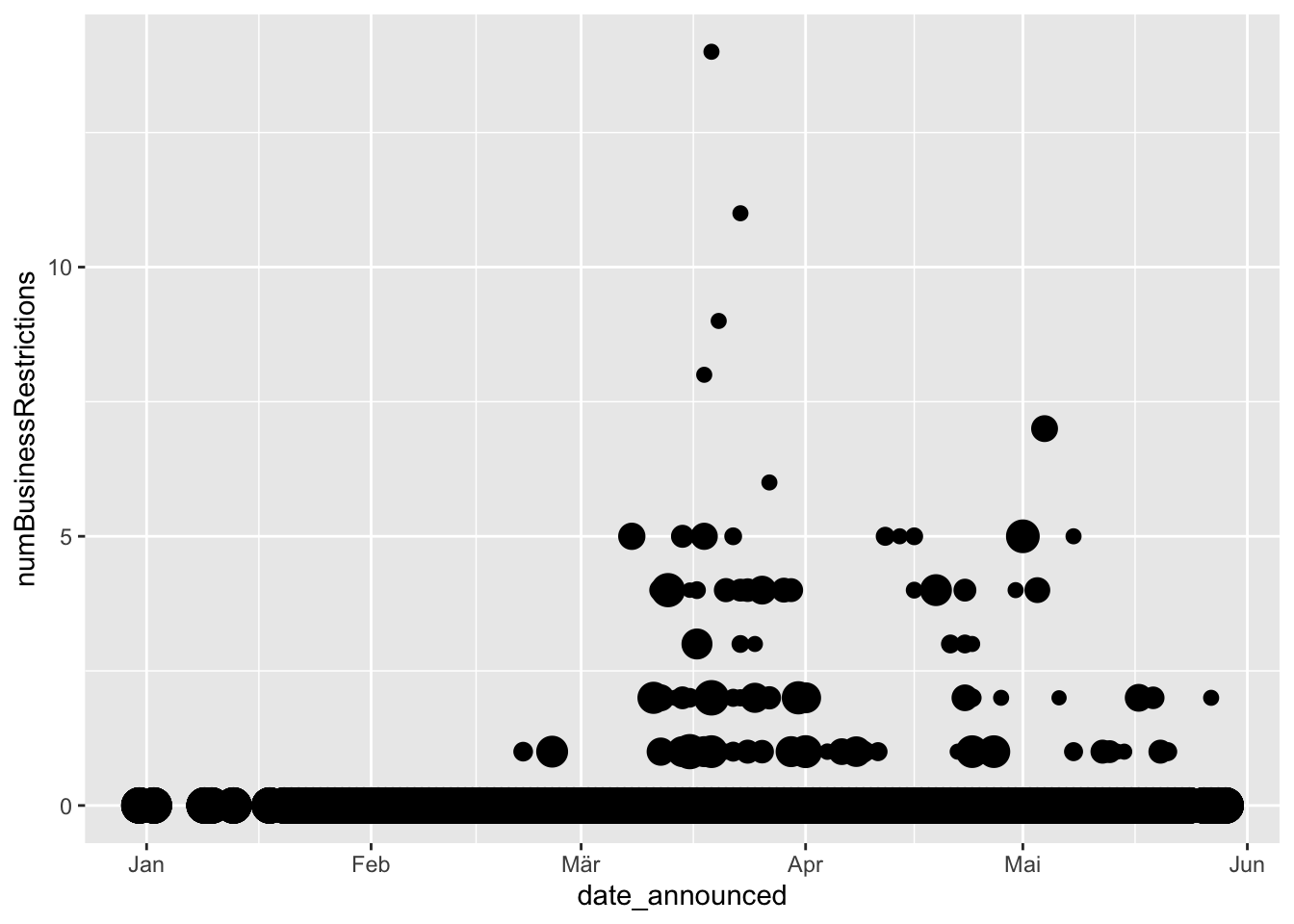
ggplot(data = businessRestrictFull) +
  geom_point(aes(x = date_announced, y = numBusinessRestrictions, alpha = country)) +
  theme(legend.position =  "none")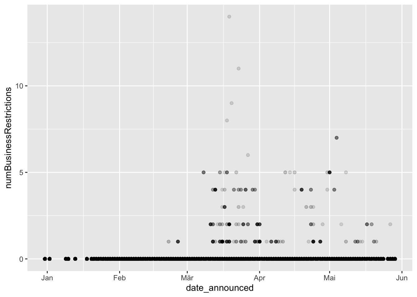
# what happens if we try to connect the dots?
ggplot(data = businessRestrictFull) +
  geom_point(aes(x = date_announced, y = numBusinessRestrictions, color = country)) +
  geom_line(aes(x = date_announced, y = numBusinessRestrictions, color = country)) +
  theme(legend.position =  "none")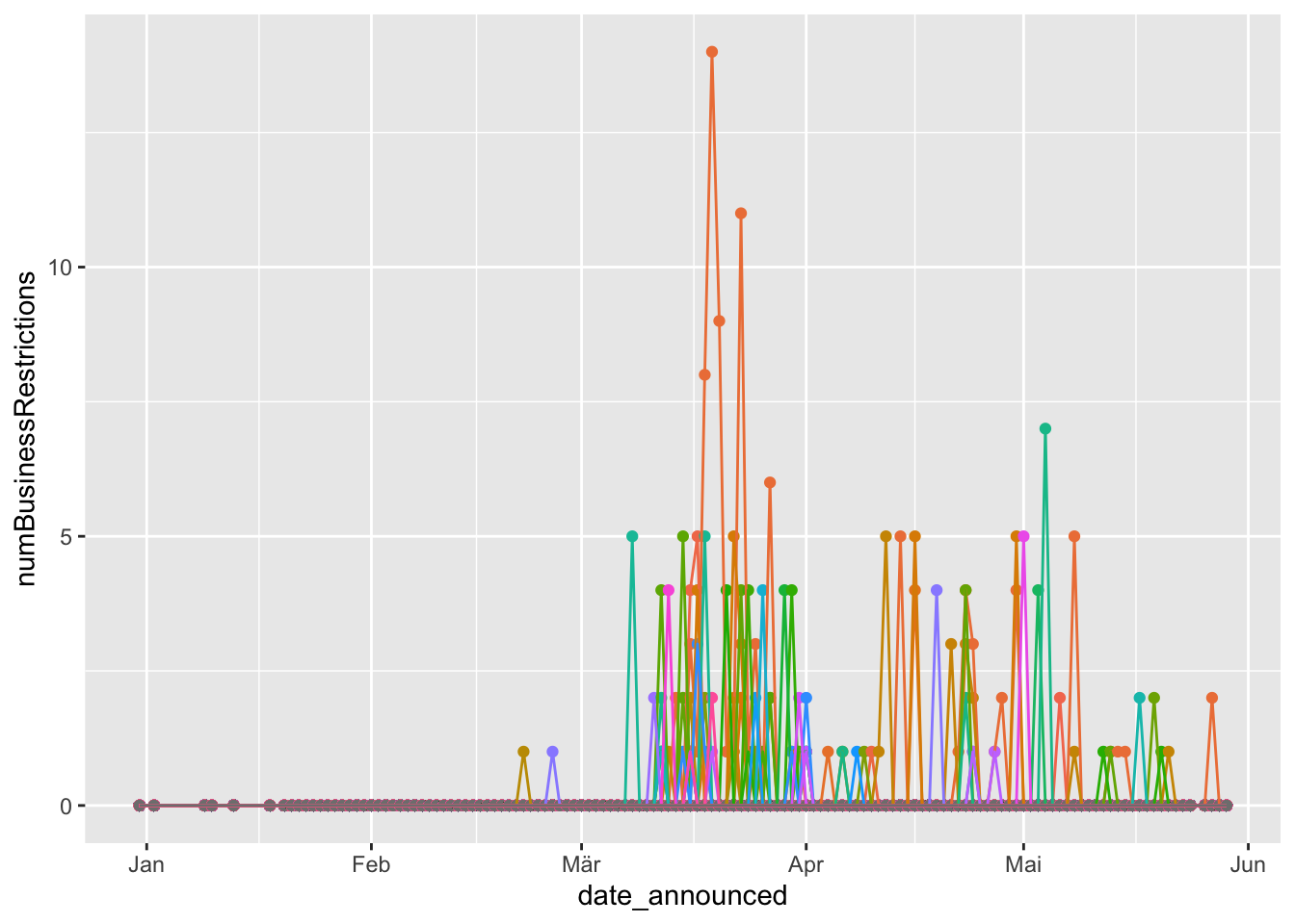
ggplot(data = businessRestrictFull %>% filter(country %in% c('China', 'Germany'))) +
  geom_line(aes(x = date_announced, y = numBusinessRestrictions, color = country)) +
  theme(legend.position =  "none")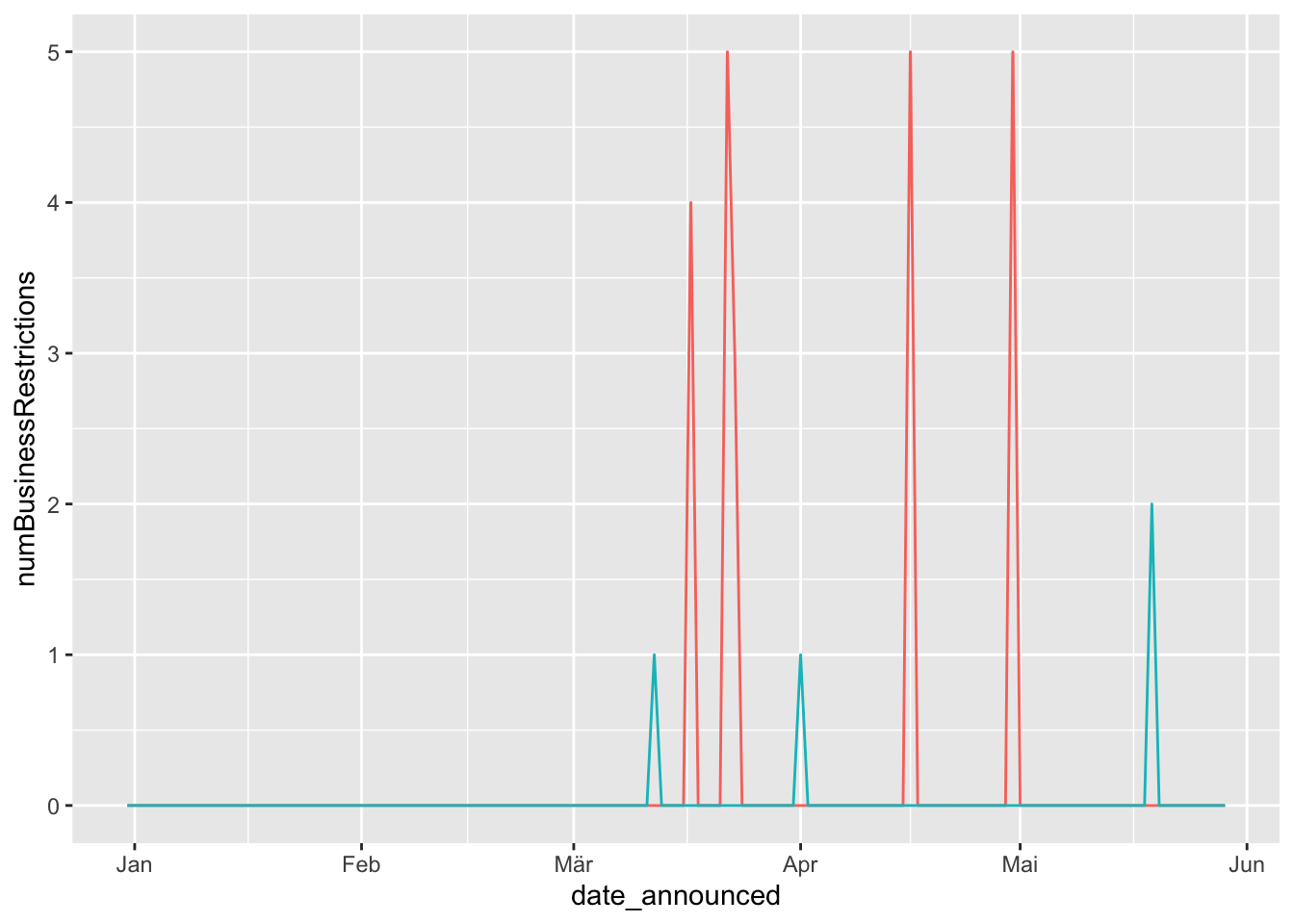
3.1 Change asthetics
ggplot(data = businessRestrictFull) +
  geom_point(aes(x = date_announced, y = numBusinessRestrictions, color = 'red'))+
  theme(legend.position= 'none')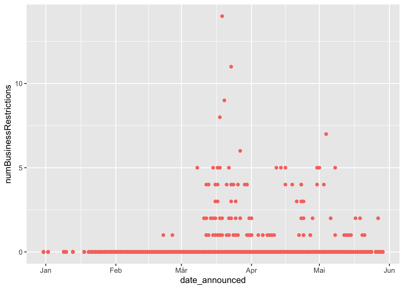
ggplot(data = businessRestrictFull) +
  geom_point(aes(x = date_announced, y = numBusinessRestrictions, size = 15) )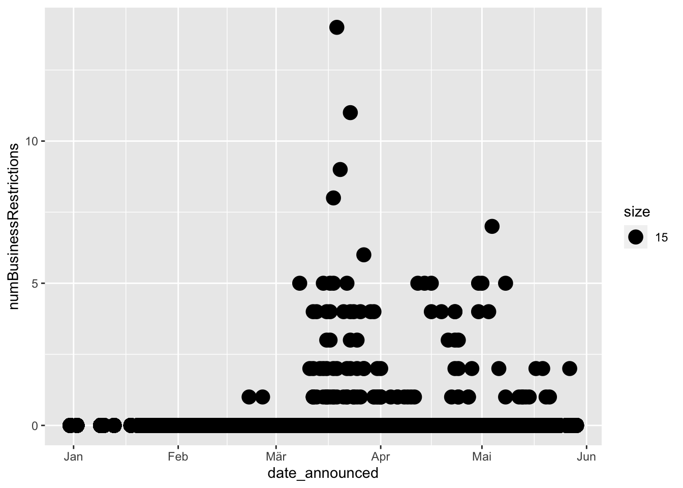
3.2 Facets
# If you want to look at each country individually, you can split your plot into facets

ggplot(data = businessRestrictFull%>% filter(country %in% c('China', 'Germany'))) +
  geom_point(aes(x = date_announced, y = numBusinessRestrictions))+
  facet_wrap(~country, nrow = 2)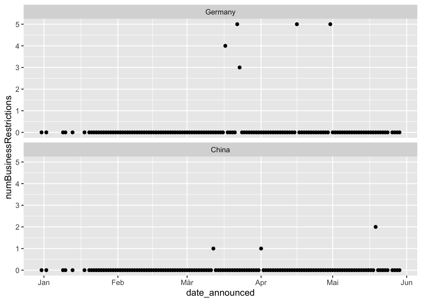
3.3 Geom Smooth
# Lets plot the smoothed out data

ggplot(data = businessRestrictFull%>% filter(country %in% c('China', 'Germany'))) +
  geom_smooth(aes(x = date_announced, y = numBusinessRestrictions))
## `geom_smooth()` using method = 'loess' and formula 'y ~ x'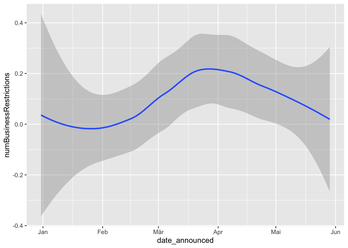
# We can layer different geoms on top of each other!

ggplot(data = businessRestrictFull%>% filter(country %in% c('China', 'Germany'))) +
  geom_point(aes(x = date_announced, y = numBusinessRestrictions, color = country))+
  geom_smooth(aes(x = date_announced, y = numBusinessRestrictions, linetype = country))
## `geom_smooth()` using method = 'loess' and formula 'y ~ x'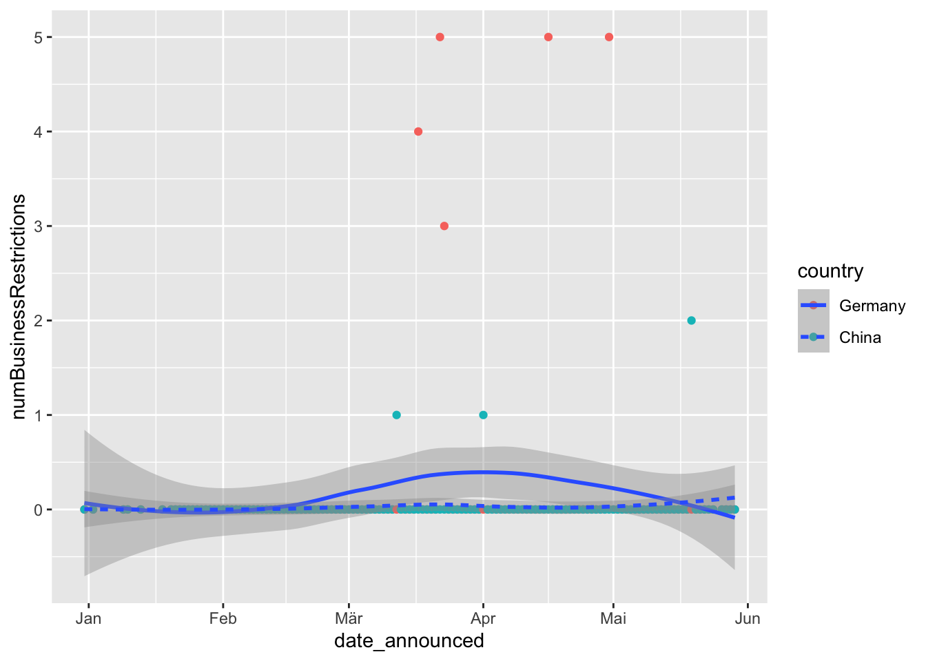
# Note geom_smooth is a predicted line, to plot the line that goes through the actual points, use geom_line
ggplot(data = businessRestrictFull%>% filter(country %in% c('China', 'Germany'))) +
  geom_line(aes(x = date_announced, y = numBusinessRestrictions, linetype = country)) +
  geom_point(aes(x = date_announced, y = numBusinessRestrictions,color = country)) +
  geom_smooth(aes(x = date_announced, y = numBusinessRestrictions, linetype = country))
## `geom_smooth()` using method = 'loess' and formula 'y ~ x'
4 Density Plots
# how about plotting density plot?
dataAgg$gdpDum = ifelse(dataAgg$gdpPPP > mean(dataAgg$gdpPPP, na.rm = TRUE), "Above Average GDP", "Below Average GDP")
dataAgg = dataAgg %>% filter(!is.na(gdpDum))
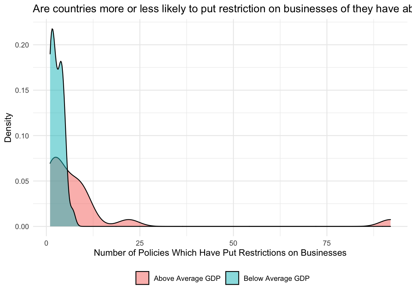
ggplot(data = dataAgg, aes(x = numBusinessRestrictions, fill = gdpDum))+
geom_density(alpha = .5)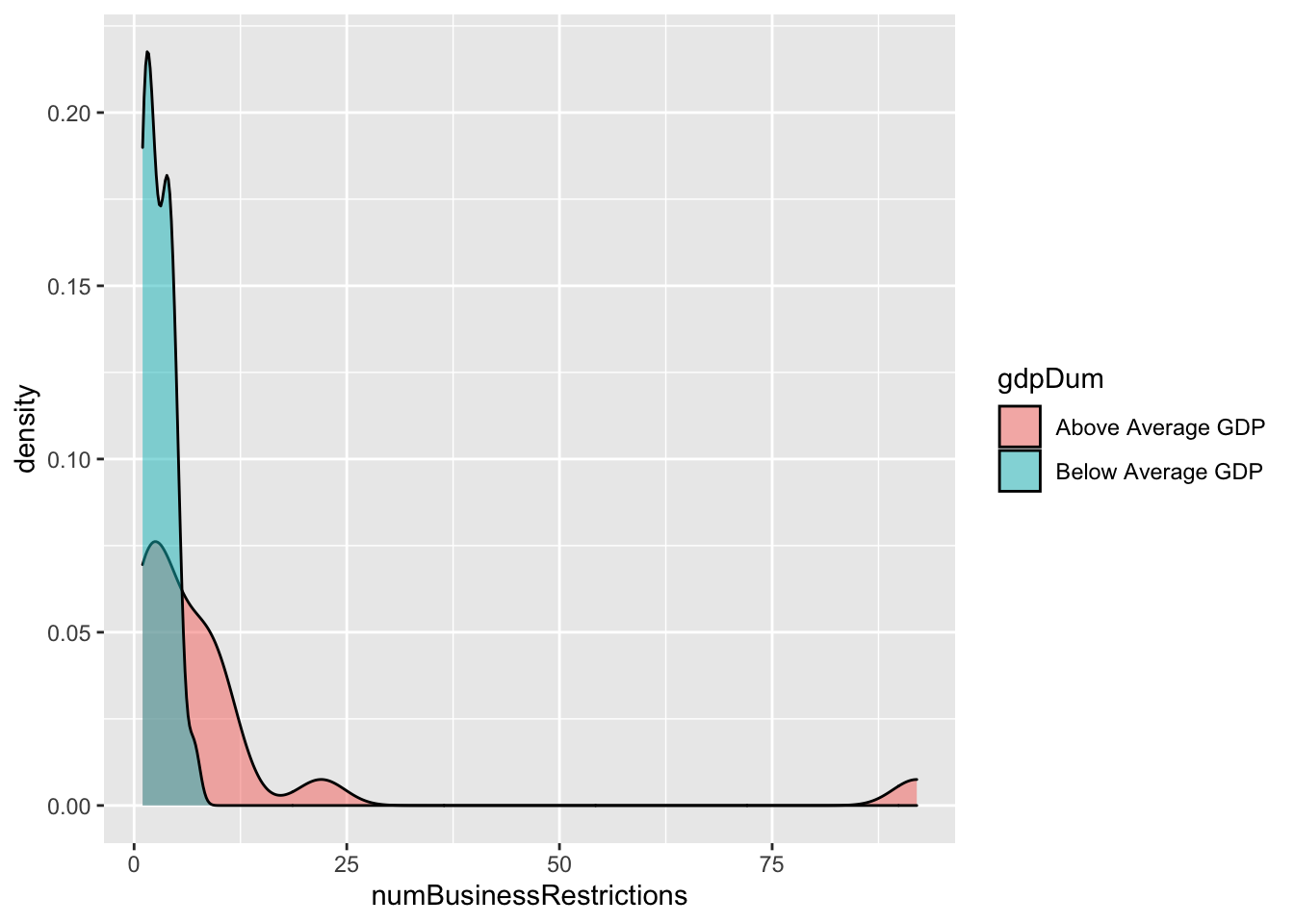
# ----------- In order to make plots understandable to others, it would be helpful to have useful labels on the plots
#http://r4ds.had.co.nz/graphics-for-communication.html

ggplot(data = dataAgg, aes(x = numBusinessRestrictions, fill = gdpDum))+
  geom_density(alpha = .5)+
  labs(title = "Are countries more or less likely to put restriction on businesses of they have above average vs. below average GDP",
       y = 'Density',
       x = 'Number of Policies Which Have Put Restrictions on Businesses')+
  theme_minimal()+
  theme(legend.position = 'bottom',
        legend.title = element_blank())